There was a rather spectacular flounce on the PhD Design listserv yesterday... shall be interesting to see how the list discussion protocol continues. Two decades of internet communication and we still haven't learned etiquette.
Meanwhile, recently on the list there was some sharing of good websites (and books) on info visualization and I thought I'd post them here.
First I must start with someone I know personally: Miska Knapek.
Miska takes various types of environmental data and turns them into 2D and 3D explorations, provoking us to see our Earth and our relationship to our environment in new ways.
Here's a look at Helsinki in 2007 - through sunlight:
 |
| Image: Miska Knapek, from here |
"On the work's vertical axis, columns of dots recount the sun's activity from the beginning of the day ( i.e 00:00 ) at top, to the day's end (ie. 23:59 ) at the bottom, in 10 minute steps. The 182 columns, from left to right, show every other day in the year, from the beginning of 2007 to the end. The size of the circles indicates the quantity of sunlight. A 2007 Helsinki's light is retold. Intensely light in summer - in the middle - with occasional rain and clouds darkening the day, and intensely dark in winter - surrounding the light summer period."
Here is wind data translated into a tangible medium:
Makes you perceive wind in a new way, perhaps? See more of his work here.
Humanitific has written several blog posts on Information Design, with some lovely examples from almost forgotten history such as this gem from Isotype Institute:
 |
| Screenshot from Humantific blog: original image source - Central Bureau Voor de Statistiek 1944-1946: Statistisch Zakboek by Uitgeversmaatschappij W. De Haan N.V. Utrecht. 1947. Diagrams designed by the Isotype Institute. Humantific Collection, New York. |
More on Isotype by Humantific here and here.
Here's another entry on Lost Stories:
"Willard C. Brinton (1880-1957) remains a relative unknown, one of several largely unsung, historical visual thinking pioneers. No entry for Brinton appears on Wikipedia, for example. Who he was, what he did, and why it was important is one of many stories buried in the history of Information Design.
Published in black and white when Brinton was thirty-four years old, the 371 page Graphic Methods for Presenting Facts is an impressive, early survey of what would today be considered to be bare-bones statistical diagrams and graphic techniques that existed at that moment. Now scarce in original form, this early volume is recognized as the first American book focused on graphic techniques geared for a general audience."
More interesting historical stuff here:
Making Sense of the Early SenseMakers
Data Visualization 1890
The Information is Beautiful site and books (David McCandless) are well-known, rightly so:
See also Manuel Lima's Visual Complexity, a huge collection of information design examples. These ones, for example, are by yWorks: a "huge site map laid out and routed organically".
 |
| Images copyright yFiles - see description here |
this, for example, is a post about CarbonVisuals' work on GHG emissions visualizations.
And on to Nathan Yau at
Flowing Data (why are these guys all male?).
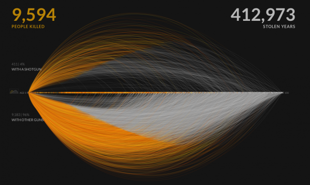
Here he posts about an interactive work by Periscopic on gun murders in the US in 2010:
it "starts with the individuals: when they were killed, coupled with the years they potentially lost. Each arc represents a person, with lived years in orange and the difference in potential years in white. A mouseover on each arc shows more details about that person."
See the original work here, including updated info from 2013.
It's cliché, but in today's complex world intelligent, wise information visualization goes far to help us understand a few things a little better - and sometimes just to have a little fun. Where these people, sites, books, and collections really contribute is to help us identify the propaganda and the dodgy methods of representation, as this work will never be neutral or without intent.
Here are a few more for your weekend viewing pleasure (thanks to those who posted these on PhDDesign):
Fernanda Viégas and Martin Wattenberg